


Tech
Quantum Key Distribution vs. Post-Quantum Cryptography: What’s the Difference?

| Key Takeaways
• Quantum key distribution (QKD) encodes cryptographic keys onto physical properties of photons, and physical QKD requires a dedicated point-to-point fiber link whose range is limited by fiber distance. • Newer “digital QKD” approaches aim to deliver similar key-distribution security properties without requiring a direct photonic link, making the technology easier to deploy over standard optical or IP infrastructure. • QKD is one input into a broader quantum-safe strategy that also includes NIST’s post-quantum cryptography (PQC) algorithms and strong symmetric encryption such as AES-256-GCM. • Estimates for when a quantum computer capable of breaking today’s public-key encryption could exist range from roughly 2030 in aggressive projections to several decades out, which is why hybrid classical/quantum-safe key exchange is being built now rather than later. |
What is quantum key distribution?
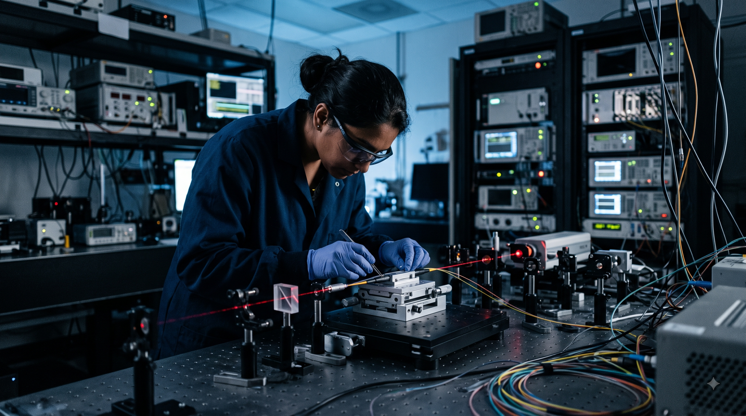
Quantum key distribution (QKD) is a method of generating and sharing an encryption key by encoding it onto the physical properties of individual photons, so that any attempt to intercept the key introduces a detectable disturbance. Physical QKD does this over a dedicated point-to-point photonic link, which means its usable range is limited by fiber distance and by how much signal loss the link can tolerate before the quantum states become unreadable.
What’s the difference between quantum key distribution and post-quantum cryptography?
Quantum key distribution physically distributes a key using quantum mechanics and dedicated hardware, while post-quantum cryptography (PQC) is a set of classical mathematical algorithms, such as NIST’s ML-KEM, designed to resist quantum attacks without needing any special optical hardware at all. The two are often paired together, hybridized with a network’s existing high-speed symmetric encryption, rather than treated as competing choices, since they protect against the quantum threat in different ways. NIST finalized ML-KEM as FIPS 203 in August 2024 alongside two signature standards, FIPS 204 (ML-DSA) and FIPS 205 (SLH-DSA), giving PQC a firm, government-endorsed specification to implement against; QKD, by contrast, has no single equivalent global standard yet, in part because physical and digital QKD implementations still vary meaningfully by vendor and deployment model.
| Approach | How it distributes the key | Hardware needed | Distance / range constraint |
| Physical QKD | Encoded onto individual photons over a dedicated optical link | Dedicated point-to-point photonic hardware | Limited by fiber distance and signal loss |
| Digital QKD | Aims for similar key-distribution security properties without a direct photonic link | Standard optical/IP transport, no dedicated photonic link required | Not limited the same way as physical QKD |
| Post-quantum cryptography (PQC) | Classical mathematical algorithms (e.g. NIST ML-KEM) | Runs on standard computing/networking hardware | No physical distance constraint |
How does digital QKD get around the distance limits of physical QKD?
Digital QKD aims to deliver key-distribution security properties similar to physical QKD without requiring a direct photonic link between endpoints, which in principle removes the fiber-distance ceiling that limits physical QKD deployments. a resource comparing physical and digital approaches to quantum-safe key generation lays out how carriers are evaluating both approaches alongside post-quantum algorithms as part of a broader quantum-safe strategy rather than picking a single method exclusively. That distinction matters operationally: a carrier that needs to protect a link between two facilities separated by a distance or fiber path that a dedicated photonic connection can’t practically reach still has a path to quantum-safe key generation through digital QKD or PQC, rather than being limited to sites within physical QKD’s usable range.
Why are carriers building hybrid quantum-safe key exchange now instead of waiting for one clear winner?
Carriers are moving now because regulatory and standards pressure has been building steadily rather than arriving all at once: a series of U.S. government directives since 2022 has progressively tightened cryptographic-inventory and migration requirements for both national-security and non-national-security systems, culminating in a June 2026 executive order that set binding migration deadlines for high-value federal assets. Executives involved in one recent telecom-focused quantum-safe partnership framed the underlying motivation in direct terms: one partner’s CEO called the need to address public-key weaknesses and harvest-now-decrypt-later exposure “beyond dispute,” while the networking vendor’s own product leadership described the approach as hybridizing third-party quantum-safe key generation with post-quantum algorithms and existing high-speed encryption capabilities, rather than betting on a single mechanism. That hybrid framing is also a practical hedge: since no regulator, standards body, or vendor can say with certainty which combination of QKD and PQC will dominate in five years, building carrier-grade hardware that supports several approaches at once reduces the risk of standardizing early on the wrong one. It also gives network operators room to phase their own rollout: a carrier can enable the post-quantum algorithm layer immediately, since it runs on standard hardware and requires no new physical infrastructure, and add physical or digital QKD support later on specific high-value links where the additional cost and complexity are easiest to justify.
When might a quantum computer actually be able to break today’s keys?
Expert estimates for when a cryptographically relevant quantum computer (CRQC) could emerge span a wide range, from around 2030 in the most aggressive near-term projections to several decades out in more conservative long-term estimates. That uncertainty is itself a reason many carriers are building quantum-safe key exchange into new hardware now rather than waiting for a firmer date, since the risk profile doesn’t require certainty to justify early action. The wide spread between the near-term and long-term estimates also reflects genuine, ongoing scientific disagreement about how quickly the error-correction and qubit-scaling challenges standing between today’s quantum computers and a fault-tolerant, cryptographically relevant machine will actually be solved, not just differing levels of caution among the people making the estimates.
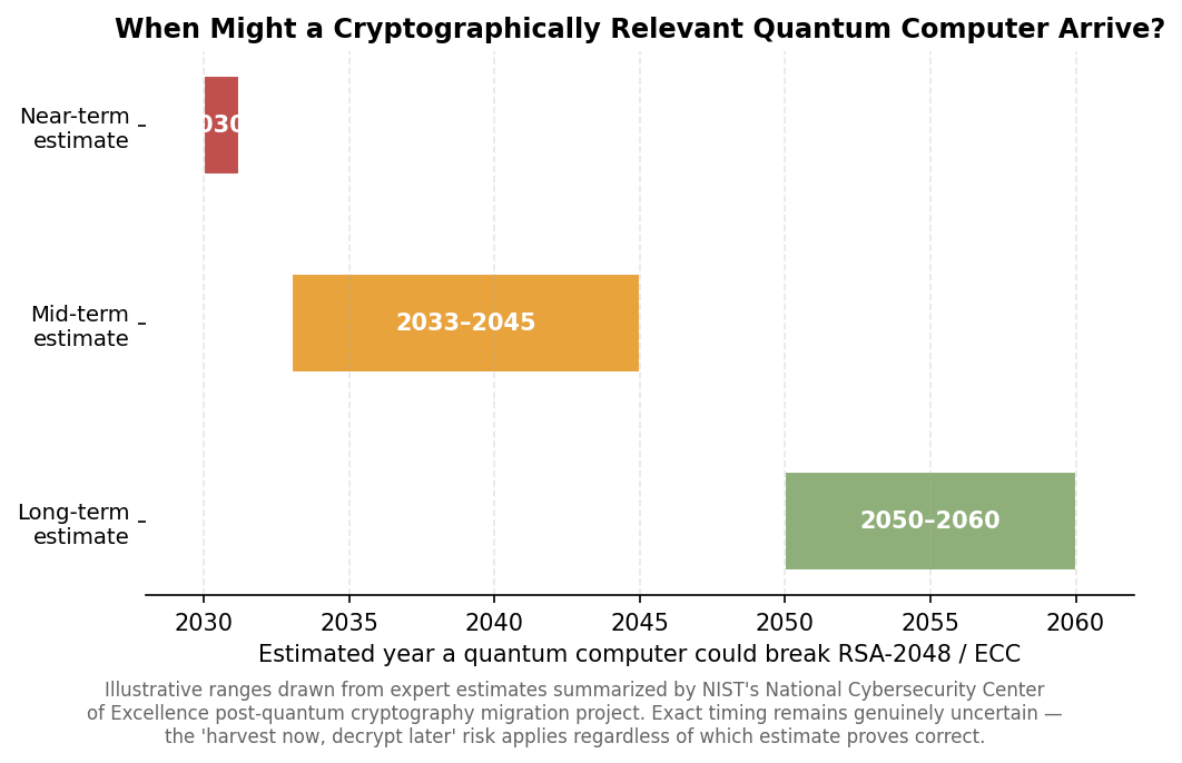
Expert estimates for when a quantum computer capable of breaking today’s public-key encryption could emerge span roughly three decades of uncertainty.
How does a real network deployment combine QKD with post-quantum algorithms?
A real deployment typically hybridizes several layers at once: a quantum-safe key-generation method (physical or digital QKD), a post-quantum algorithm for key exchange, and a high-speed symmetric cipher such as AES-256-GCM for the actual bulk encryption of network traffic. the carrier-grade launch announcement supporting programmable quantum-safe key exchange describes hardware built specifically to run this kind of hybrid key exchange at full 400G line rate rather than as a separate, bolt-on appliance. a hardware resource covering demarcation and aggregation for AI-era interconnect traffic goes into more detail on how that kind of platform fits into a broader data center interconnect deployment.
Why not just wait for one single standard to settle before deploying anything?
Waiting for a single settled standard carries its own risk, because published national migration roadmaps already assume multi-year, phased rollouts rather than a single future cutover date. the UK’s national cyber security agency’s phased migration timeline lays out a three-phase plan running from 2025 through 2035, which means networks that start hybridizing quantum-safe key exchange earlier have more runway to work out interoperability issues before later, harder deadlines arrive.
Frequently Asked Questions
Is quantum key distribution the same as post-quantum cryptography?
No. Quantum key distribution physically generates and shares a key using quantum mechanics, while post-quantum cryptography is a set of classical algorithms designed to resist quantum attacks without special optical hardware; the two are often combined rather than used as substitutes for each other.
Does quantum key distribution require special hardware?
Physical quantum key distribution requires a dedicated point-to-point photonic link, while digital QKD approaches aim to deliver similar security properties over standard optical or IP infrastructure without that dedicated photonic hardware.
Can quantum key distribution be used over standard fiber networks today?
Physical QKD is constrained to dedicated links with fiber-distance limits, but digital QKD and post-quantum cryptography are both designed to run over standard network infrastructure without that same constraint.
Why combine QKD with post-quantum algorithms instead of choosing just one?
Combining them creates a hybrid approach where a network stays protected under one method even if a weakness is later found in the other, which is why carrier-grade hardware increasingly supports both at once rather than relying on a single quantum-safe mechanism.


|
Key Takeaways
|
What does cloud based live video production actually replace?
Traditional live production has historically depended on physical hardware: a dedicated video switcher, audio mixer, graphics system, and often a production truck to house it all. LiveU Studio represents a full shift away from that model, described as a 100% cloud-native, scalable live video production solution enabling live switching, audio mixing, customized overlays, graphics, remote guest management, and one-click distribution to up to 30 different, simultaneous digital destinations, all from a web browser rather than dedicated on-site hardware.
What does a cloud video switcher actually let a single operator manage?
A cloud video switcher consolidates what would traditionally require several specialized crew members and dedicated hardware stations into one browser-based interface a single operator can run. That includes instant replay, letting a production team relive game-changing moments with multi-angle replays and slow-motion playback, seamlessly replaying up to four camera angles in sync with a single click; ISO recording, capturing independent feeds from up to six cameras for post-production flexibility; and dynamic ad insertion, unlocking additional revenue streams across OTT and FAST platforms through automated marker insertion. A revamped, unified interface lets that single operator move quickly between switching, replay, and graphics on one screen, balancing speed and creativity even for demanding, fast-moving live events.
| Cloud switcher capability | What it replaces or simplifies |
|---|---|
| Live multi-cam switching | A dedicated hardware video switcher and the crew typically required to operate it. |
| Instant replay & ISO recording | Separate hardware replay systems and individual camera recording devices. |
| Remote guest management | Physical satellite or fiber links needed to bring a remote guest into a broadcast. |
| One-click multi-platform distribution | Manually configuring separate outputs for each individual streaming destination. |
What does an AI live production unit actually add at the point of capture?
While cloud production tools handle switching and distribution, a separate innovation is happening at the point of capture itself. The LU900Q intelligent production unit is the first field unit to natively integrate LiveU IQ (LIQ™), using AI-driven decision-making and smart operator selection to optimize connectivity in real time. Combined with integrated eSIM technology and optimized 5G modems, this AI-driven optimization keeps a unit connected reliably even in challenging locations like crowded stadiums or remote racetracks, without requiring a human operator to manually manage which network connection the unit is using at any given moment.
How does an AI live production unit actually make field production feel more like a studio?
Beyond connectivity optimization, an AI live production unit is designed to bring studio-level capability directly into field conditions. LiveU’s announcement of the LU900Q highlights dual video return and dual intercom as key additions, bringing the benefits of a studio environment directly to reporters working in the field. The unit supports single or dual-camera production workflows, transforming what used to be rigid broadcast setups into dynamic, adaptable production environments, while delivering 10-bit HDR 4:2:2 encoding with up to 32 audio channels for high-end productions requiring accurate geolocation and uncompromising performance.
How fast has investment in cloud video production actually grown?
The shift toward cloud-based production tools has accelerated sharply, driven substantially by the pandemic-era need for physically distributed production teams. Rethink Technology Research’s Cloud Production Technologies forecast projected global cloud production revenues would rise from approximately $601.87 million in 2020 to about $2.48 billion in 2026, more than tripling over six years, with sport identified as the single biggest driver of that growth. That trajectory reflects how thoroughly cloud-native tools have moved from an emergency pandemic workaround to a standard, ongoing part of how live productions actually get made.
How do a cloud video switcher and an AI live production unit actually work together?
- The field unit captures and transmits, using AI-driven connectivity optimization to maintain a stable feed regardless of changing network conditions.
- The cloud switcher receives and produces, handling live switching, graphics, and audio mixing entirely through a browser interface.
- Together they eliminate the need for on-site production trucks, since neither capturing nor producing the show requires dedicated hardware physically present at the venue.
- Both scale independently, letting a production team add field units or production capacity separately as a show’s requirements grow.
What does a modular, hybrid approach to cloud production actually mean for existing infrastructure?
Adopting cloud based live video production doesn’t necessarily mean abandoning existing hardware investments; a modular, hybrid ecosystem approach lets these components integrate with a current setup rather than requiring a full rip-and-replace transition. Combining field units delivering reliable, real-time feeds with cloud-native production tools lets a team scale output and engage more audiences across linear and digital channels using the same current staff and resources they already have. That modularity matters for organizations weighing a gradual transition, since it lets a production team adopt cloud switching for some shows or events while continuing to rely on existing hardware for others, rather than forcing an all-or-nothing decision before the benefits have been proven internally.
What should a production team weigh when deciding how much to shift toward cloud based workflows?
The right balance between cloud and on-premises production tools depends heavily on show complexity, team distribution, and existing infrastructure investment. A single-operator, multi-camera sports show with a distributed remote crew is a natural fit for a fully cloud-based approach, since the format’s flexibility advantages align directly with the production’s actual requirements. A large-scale broadcast with an already-built, deeply integrated on-site production truck may see less immediate benefit from a full migration, at least until that existing hardware genuinely reaches the end of its usable life. Evaluating the shift honestly, rather than assuming cloud production is automatically the right answer for every format, tends to produce better long-term technology decisions than following the industry trend uncritically.
Frequently Asked Questions
Do I need a production truck to use cloud based live video production?
No. That’s the core value proposition: cloud based live video production replaces the need for on-site hardware switchers and production trucks, since switching, graphics, and distribution all happen through a browser-based platform instead.
What makes a field unit qualify as an ‘AI live production unit’?
The defining characteristic is AI-driven decision-making applied directly to connectivity and production management, such as automatically optimizing which network connections to use in real time, rather than requiring manual operator intervention for those decisions.
Can a cloud video switcher handle a live sports broadcast with multiple camera angles?
Yes, a cloud video switcher built for this purpose supports fully synced multi-camera switching, instant replay across multiple angles, and independent ISO recording of each camera feed, covering the core requirements of a multi-camera sports production.
Why did cloud video production revenue grow so quickly between 2020 and 2026?
The COVID-19 pandemic accelerated adoption by forcing production teams to work from physically distributed locations, and sport was identified as the single biggest driver of that growth, given the format’s natural fit for remote, multi-camera cloud production.
|
Key Takeaways
|
Why does book binding determine how fast a collection can be digitized?
A large part of the cultural heritage community works on digitizing rare and delicate bound materials, and the binding itself is often what dictates how quickly that work can safely proceed. Phase One’s book digitization solutions are built around this reality directly: digitization of books often requires special attention to the binding, which can be fragile, and that fragility can become the limiting factor when an institution is looking for a fast capture turnaround. A binding that can’t be opened flat, for instance, rules out certain capture approaches entirely, regardless of how fast the camera itself can shoot.
How does a copy stand actually speed up the capture process?
Copy stands are the workhorse tool behind this entire workflow. Using a leveled glass plate with the camera set for fixed focus on a copy stand accelerates the capture process considerably, since the operator no longer needs to refocus or reposition for every single page. Photographing both pages of an open book at the same time, using one or two cameras, increases productivity further still. Institutions with valuable collections often maintain a dedicated photographic studio built around exactly this workflow, both to provide public access and research copies and to protect fragile originals from the wear and handling that repeated researcher access would otherwise cause.
How much faster is rapid-capture digitization than traditional scanning?
The gap between purpose-built digitization systems and conventional scanning equipment is large enough to change what’s realistically achievable for a big collection under time pressure. Fast, reliable digitization solutions built for transparent film and glass plate negatives can achieve a capture rate of roughly one image per second, up to 400 times faster than flatbed, drum, or virtual-drum scanners.
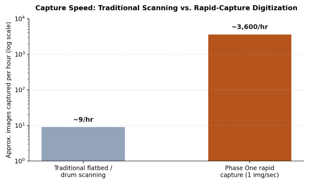
Approximate capture speed comparison between traditional flatbed or drum scanning and rapid-capture digitization (log scale).
That speed difference matters most because preserving the past is often a race against time: much of the material institutions are digitizing has a limited physical lifespan before it’s gone for good, so a workflow capable of moving through a large collection quickly can mean the difference between preserving a complete archive and losing part of it before the work is finished.
What copy stand configurations exist for different collection types?
| Copy stand type | Best suited for |
|---|---|
| Single-camera stationary stand | Smaller digitization projects needing a stable, long-lasting platform with one high-resolution camera system. |
| Dual-camera book system | Rare books that cannot be opened flat, using an automated dual-page capture workflow with two cameras. |
| AutoColumn large-format stand | Large, flat, and thin objects such as maps, newspapers, and drawings, with a metal cover board for secure magnetic positioning. |
| Motorized 2-motion stand | Larger flat objects requiring a bigger baseboard and flexibility across different lens configurations. |
What does digitizing the autochrome process actually involve?
Understanding the autochrome process itself helps explain why these plates need such careful handling. Autochrome plates, a color photography process that flourished from 1907 into the 1930s, present a distinct challenge inside cultural heritage digitization: each autochrome is a unique transparency image with no negative counterpart, meaning there is no duplicate to protect against a mistake during capture. Phase One’s film and glass plate digitization solutions address this class of material with a film capture stage that provides an adjustable, geared support mechanism compatible with a range of carriers built specifically for glass plate negatives, alongside most popular film strip and sheet formats. Glass plate carriers are made of milled high-grade aluminum with an optically-optimized glass base, built to hold plates of varying and sometimes irregular sizes securely and consistently during capture.
The conversion process for this kind of transparent, historical material is genuinely open to interpretation, since the base material and the chemical processing used varies, especially for the earliest glass plates where the specific chemicals and development process are often unknown. Two rolls of film, or two glass plates, may behave very differently, both in the physical characteristics of the original base material and in how that material was originally developed, which is part of why uniform, controlled illumination and consistent color reproduction matter so much throughout the capture process.
What does a well-run digitization workflow need beyond the camera and stand?
- Specialized workflow software: a rapid-capture solution paired with cultural heritage editing tools speeds up both capture and the post-production work of converting negatives to positives and correcting color.
- Simplified interfaces for large volumes: a streamlined capture mode allows less-specialized operators to handle high-volume digitization projects without sacrificing consistency.
- Accurate object identification: integrated barcode scanning during capture helps ensure every digitized object is named and tracked correctly across a large collection.
- Material-appropriate handling: different physical formats, bound books, flat documents, glass plates, each require their own specialized stand and carrier configuration rather than a one-size-fits-all setup.
What quality standards guide professional cultural heritage digitization?
Institutions digitizing valuable or fragile collections don’t simply capture an image and call it done; the output has to meet recognized quality benchmarks that ensure the digital copy is actually fit for long-term preservation and research use. Standards such as FADGI (the Federal Agencies Digital Guidelines Initiative), Metamorfoze, and ISO 19264 define specific technical targets for resolution, color accuracy, and tonal range, giving institutions a common language for specifying what “high quality” actually means in measurable terms rather than a subjective judgment. Meeting these benchmarks typically requires resolution around 300 pixels per inch or higher for most collection material, alongside carefully controlled, even illumination and accurate color calibration throughout the capture process.
| Standard | What it primarily governs |
|---|---|
| FADGI (Federal Agencies Digital Guidelines Initiative) | A star-rating system for image quality covering resolution, tonal response, and color accuracy, widely referenced across libraries and archives. |
| Metamorfoze | A Dutch national standard for image quality in cultural heritage digitization, with defined preservation and access quality tiers. |
| ISO 19264 | An international standard defining objective image quality analysis methods for cultural heritage reproduction. |
What happens to digitized material after capture?
Capture is only the first stage of a complete digitization program. Once an image is captured, it typically passes through post-production steps that can include cropping and alignment, negative-to-positive conversion for film and glass plate material, color correction against calibrated reference targets, and quality control review against whichever standard the institution has adopted. The resulting files are then usually stored in an uncompressed or losslessly compressed master format intended for long-term preservation, alongside smaller derivative files optimized for public access and online display. Metadata capture, recording what the object is, where it came from, and any relevant rights information, runs alongside this whole process, since a beautifully captured image with poor metadata is far less useful to future researchers than a properly documented one.
Frequently Asked Questions
Why can’t hidden or delicate bindings just be opened flat for faster scanning?
Forcing a fragile binding open flat risks damaging the book permanently. Digitization systems built for rare books instead use a dual-camera setup that photographs both pages simultaneously at whatever angle the binding safely allows, rather than forcing the book into a position that risks the original.
What makes autochrome plates harder to digitize than an ordinary photograph?
Each autochrome is a unique transparency with no negative, so there’s no backup if a plate is damaged during handling or capture. The plates are also physically fragile glass, and the exact chemical composition of early examples is often unknown, which makes consistent, accurate color reproduction more challenging than with a standard, well-documented film stock.
How much faster is rapid-capture digitization really, in practical terms?
Systems capable of roughly one image per second can be up to 400 times faster than flatbed, drum, or virtual-drum scanners, which can turn a project that would take months of scanning into one that takes days.
Does a copy stand work for objects other than books?
Yes. Different copy stand configurations exist for flat objects like maps and newspapers, for glass plate negatives and film, and for bound books specifically, each with hardware suited to that particular format’s handling and stability needs.
|
Key Takeaways
|
What is AI TRiSM, and why did Gartner define it?
AI TRiSM stands for AI Trust, Risk, and Security Management, a framework Gartner introduced to describe the technical capabilities organizations need to keep AI systems trustworthy, secure, and compliant, not just when they’re first deployed, but continuously as they operate. The framework’s core argument is that policies alone can’t keep up with how AI systems behave in production: risks emerge dynamically as models respond to new inputs, so governance has to be embedded directly into the systems themselves, through continuous monitoring, validation, and runtime enforcement, rather than relying on periodic review cycles.
Why is the AI TRiSM market growing so much faster than most security categories?
The growth rate here is unusually steep even by cybersecurity standards. MarketsandMarkets’ AI TRiSM market research projects the market will grow from $3.09 billion in 2026 to $11.61 billion by 2031, a compound annual growth rate of 30.3%, driven in large part by the shift from periodic AI assessments toward continuous control as enterprises deploy autonomous, tool-using AI agents. Within that broader market, the AI security and runtime protection platforms segment is forecast to grow even faster, at roughly 33.1% CAGR, which tracks closely with why runtime enforcement, not just governance policy, has become the fastest-moving part of this space.
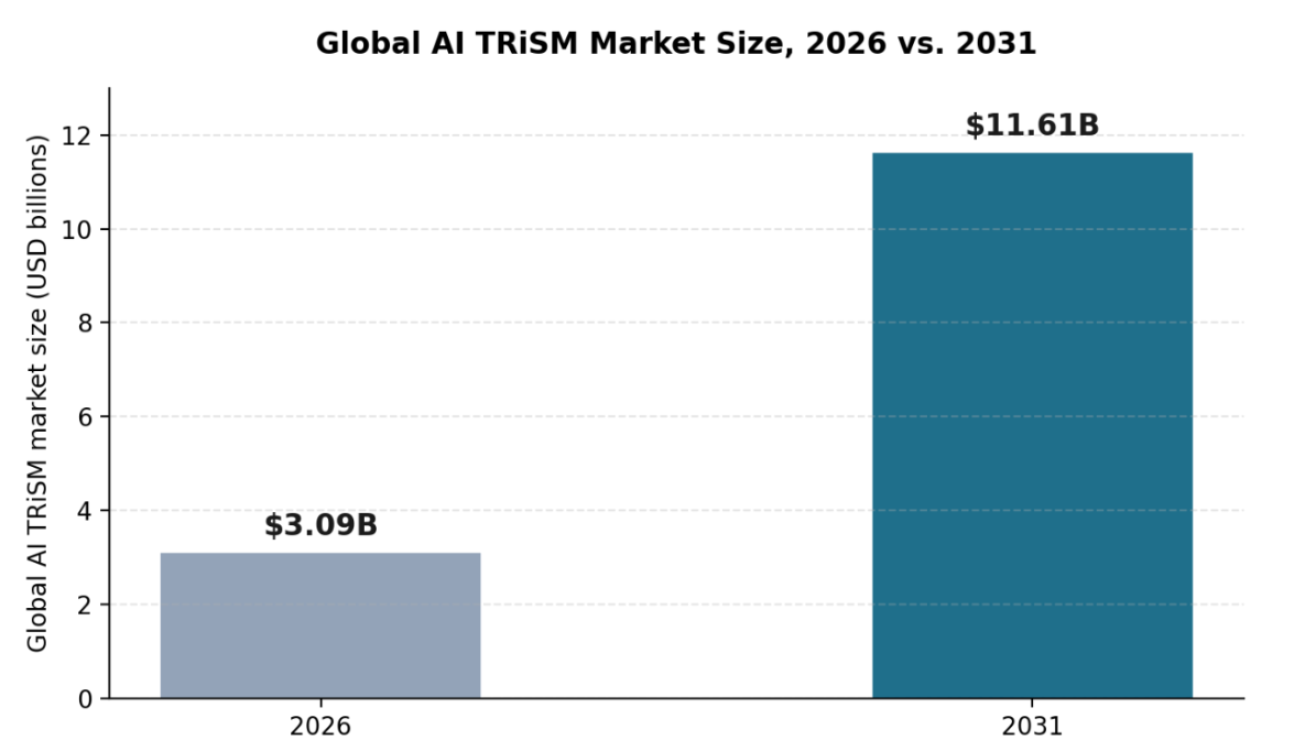
Global AI TRiSM market size, 2026 versus 2031, according to MarketsandMarkets.
What does an AI security platform actually need to cover?
| Pillar | What it covers |
|---|---|
| Discovery (AI-SPM) | A continuous, complete inventory of every AI application, agent, and tool operating across the organization. |
| Runtime protection (guardrails) | Input and output filtering that catches prompt injection, data leakage, and policy violations as interactions happen. |
| Agentic AI security | Visibility into agent decisions, tool calls, and data access, with enforcement that keeps autonomous behavior within intended scope. |
| Compliance & governance | Policy definition and audit-ready documentation mapped to regulations like the EU AI Act, GDPR, and industry-specific standards. |
The case for covering all four pillars from a single AI security platform, rather than four separate point tools, is largely operational: security teams need discovery findings to feed directly into policy enforcement, and agent behavior data to feed directly into compliance reporting, connections that are much harder to maintain across disconnected tools than within one shared system.
Why does agentic AI security specifically need its own attention?
A static chatbot answers questions; an autonomous agent takes actions, and that distinction changes the security calculus considerably. Ovalix’s autonomous and agentic AI security platform is built to give full visibility of AI agent tasks from start to finish, mapping out each decision so guardrails can be enforced and compliance maintained across AI-driven processes, rather than only reviewing outcomes after an agent has already acted. A closely related capability focused specifically on agent behavior safeguards AI agents from malicious manipulation, unauthorized control, and excessive autonomy, which matters because an agent with too much unchecked scope is a fundamentally different risk than a chatbot that simply gives a wrong answer.
What does ‘AI security software’ actually mean in practice?
In practice, the term increasingly refers to platforms consolidating what used to be handled by separate tools, or not handled at all, into one system: shadow AI discovery, data protection, runtime guardrails, and agentic oversight, unified under a shared policy engine and a single source of truth for what AI is running and what it’s doing. That consolidation trend mirrors what happened in adjacent security categories before it, where point solutions eventually gave way to platforms once the operational cost of stitching together separate tools outweighed the benefit of best-of-breed components for each narrow function.
Questions to ask when evaluating an AI security platform
- Does discovery run continuously, or only as a periodic scan that goes stale between runs?
- Does the platform cover agents as well as applications, including tool calls and autonomous decision chains, not just chatbot-style interactions?
- Are guardrails applied in both directions, filtering prompts going in and responses coming out?
- Does compliance reporting draw from the same data as enforcement, or does it require separately maintained records that can drift out of sync?
Frequently Asked Questions
Is AI TRiSM a specific product, or a framework?
AI TRiSM is a framework defined by Gartner, describing a set of capabilities organizations need, not a single named product. Different vendors, including AI security platforms, implement AI TRiSM’s principles in different ways.
Do small organizations need a full AI security platform, or just point tools?
It depends on the scale and complexity of AI usage, but even smaller organizations benefit from discovery and runtime protection working together, since the two feed each other: what you discover shapes what you need to enforce, and vice versa.
What’s the difference between AI security software and general cybersecurity software?
AI security software is purpose-built for risks specific to AI systems, prompt injection, model behavior monitoring, AI agent oversight, that general cybersecurity tools, built around network traffic and endpoint behavior, typically aren’t designed to catch.
Why is agentic AI considered higher risk than earlier generative AI tools?
Because agents don’t just generate text, they take actions and call tools, often chaining multiple steps together autonomously. That expands the potential consequences of a security gap well beyond what a single bad response from a chatbot could cause.
Tomato Breeders and the Push Toward Innovative Specialty Varieties
Cloud Based Live Video Production and the AI Live Production Unit
Book Digitization, Copy Stands, and Digitizing the Autochrome Process

-

 Business Solutions2 years ago
Live Video Broadcasting with Bonded Transmission Technology
-

 Business Solutions1 year ago
The Future of Healthcare SMS and RCS Messaging
-

 Business Solutions2 years ago
2-Way Texting Solutions from Company Message Services
-
 Business Solutions2 years ago
Communication with Analog to Fiber Converters & RF Link Budgets
-
 DSRC Communication2 years ago
The Crossroads of Connectivity: DSRC vs. C-V2X Technologies in Automotive Communication
-

 Business Solutions2 years ago
Wholesale SMS Platforms with OTP Services
-

 3D Technology1 year ago
How Multispectral Cameras Advance Book Scanning
-

 Business Solutions2 years ago
Choosing the Right B2B Digital Marketing Agency: A Guide